

- Free Article: No
- Contents Category: Publishing
- Review Article: Yes
- Article Title: Bookshapes - June 1979
- Online Only: No
- Custom Highlight Text:
The dustjacket designer Christopher McVinish has given the title of this novel an unforgettable identity, with the figure of a soldier superimposed in red on the second one of 1915, which is in black. It is a powerful image that immediately announces the subject of the novel. Most of what follows is disappointing, and apparently not due to McVinish.
- Book 1 Title: 1915
- Book 1 Biblio: University of Queensland Press
- Book 2 Title: A Question of Polish
- Book 2 Subtitle: The antique market in Australia
- Book 2 Biblio: Collins, designed by Robin James
- Book 2 Cover Small (400 x 600):
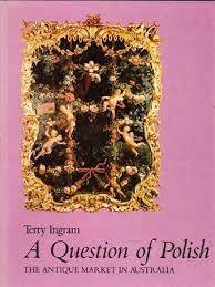
A Question of Polish: The Antique Market in Australia.
By Terry Ingram. Collins. Designed by Robin James.
This is a soundly produced, conventional book. With its purple jacket and powder-blue endpapers, it reminds me of the delightful, inconsequential Weekend Books of John Hayward. The text is well set and evenly printed, and the half-tone wraps are crisp and attractive, the black and white sides of the art sheets no less pleasing than the colour. The only reason why I refer to the book is because of its erratum slip – always an embarrassing thing to include, but something for which publishers should be praised. This one, which refers to a mistaken credit for the restoration of Elizabeth Bay House, Sydney, is by some mischance printed in a larger size of type than the text itself. It makes the confessional gesture seem ostentatious. Someone to whom I pointed this out tartly replied that while they were about it the publishers should have made it errata, not erratum, for the correction immediately follows a paragraph in the ‘Acknowledgements’ in which the poem ‘In Tyrrell’s Book Shop’ is attributed to ‘Kenneth Slessor’. However, editorial slips are not my concern, and for the thorough professionalism of its production I give the book two picas.
Language as a Sign System: Linguistics in the Australian context.
By John Bernard and Arthur Delbridge.
Prentice-Hall of Australia.
There is no reason to look down on books that are reproduced direct from good electric typescript. It is economical, and a clean and readable result can be achieved if the original is well set out and properly scaled. (The AGPS Style Manual offers good advice on the subject of typing for reproduction). Language as a Sign System, however, is a contemptible example of the genre. The fore-edge and back margins are of about seven millimetres, and the head margin actually gets down to two millimetres on many pages. Any student who wants to make a marginal note here can forget it! There are no margins. This suffocating book could have been perfectly acceptable if the typescript had been sized only a little differently. The puzzling thing is – did nobody ever query the way it was turning out? No picas.
Big Toys.
By Patrick White.
Currency Press.
The cover of this small paperback fell off the first time I opened it. It is a good cover too: Brett Hilder’s seductive photograph in black and silver of Kate Fitzpatrick as Mag Bosanquet, with the playwright’s name and the title in white and purple. The eighty-page text is unevenly printed and a little crowded, but the production halftones lend it interest. I thought the preliminaries would have been more inviting had not the half-title been occupied by a full page of biographical notes on the playwright. They could have been fitted in later with the title of the play standing alone on the first page as a curtain-raiser. One and a half picas.
As it Was…
By Bruce Beaver.
University of Queensland Press.
I admired this short autobiographical book for its very simple typography. The prose extracts, and the poems alike have titles in upper and lower case in the same size as the text face itself, with a thin rule setting them off from what follows. You can’t do anything more plainly than that. The book is illustrated with snapshots from a family album. They are humble snapshots too, but the designer has given them dignity and heightened interest by keeping them small, and by using them only one to a whole page, each on a background square of grey. It shows what can be done with modest material, and the value of isolating the single image and printing it away from competition with other visual distractions. The front endpaper is a school-class photograph in dark brown, and the faces of several boys down the centre line have unluckily disappeared into the inner joint. Also, I notice that the As It Was… of the title page is rendered As it Was… on the jacket, which may be better but does not say much for consistency. This is not a sensational production, but it has a pleasant and contemporary feeling about it. Two picas.
Comments powered by CComment